|

Click on the image to see
a larger view.
|
The blank page--it can
be a pretty scary thing. To get to this point, I've already cut and stretched
a sheet of paper. For my bigger paintings, I cut paper from an Arches
Watercolor Roll. The roll is 45 inches across and 10 feet long. I usually
cut the paper about 34 inches by 45 inches. Once the paper is cut to size,
I cut some butcher tape to the same measurements and make sure my staple
gun has plenty of staples. I wet a sponge for the butcher tape and take
my paper to the bath tub. I soak it for a couple of minutes, bring it
back to the studio and put in on a piece of plywood, attach the butcher
tape, and staple it about every two inches.
|
|
You can't see the drawing very well in
this thumbnail, but if you click on the image, you will get a larger presentation
of the finished drawing.
|
After the paper has dried,
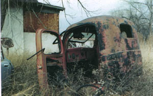
I start the drawing. With one of these cars or trucks, there is a lot
to the drawing. I don't skimp on making sure I have everything in and
just right. I've learned over the years that it pays to think the whole
thing through and get it right the first time. It is pretty aggravating
to get half way through a painting of this size and effort and find you
have left something critical out. These line drawings usually take 2 to
3 hours.
|
|
Again, you can't see the
thumbnail very well. Click for a larger image.
|
Once the drawing is complete,
I mask off areas that are too small to painting around comfortably. In
this particular composition, there are some trees cropping in from the
upper left, and I want to paint that area wet and fast. I also mask off
a number of weeds in the bottom of the painting. Again, I want to paint
those areas pretty loose and wet, and don't want to take time to work
around the weeds.
|
|
|
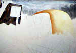
Generally I start my
paintings with the sky--they are painted wet on wet and seem like a good
place to warm up. In this painting, I wanted to overly the trees on the
right with the wash of the sky, so elected to begin the painting with
those trees. Not much happening with them, just some tree trunks with
a medium value--the color was a mixed blue gray using thalo blue, red
rose, and quinacridone gold.
|
|
|
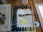
The wash coming up is
for the sky. I try to pre-mix enough pigment to do the job, but many times
find myself a little short. It isn't a big problem--more pigment can be
mixed in short order. Here I have mixed a color similiar to the trees,
but a little warmer gray--thalo blue, red rose, and quinacridone gold--but
more red rose to keep it on the warm side.
|
|
|
To lay in the sky, I
first wet the whole sky area. Once I have that area wet, I start lacing
the area with pigment. I say lacing because I'm trying to bring areas
of pigment onto the paper, but not so consistently that I have a pure
gradiation. I want white areas so show up, creating the effect of clouds
and overcast. I also like to make the washes stronger in the corners--that
seems to block the eye from moving off of the page. When I do this sky
thing with my art students it doesn't take them long to catch on. The
hardest part is making sure you don't do too much. Quick laced washes
and then stop!!!
|
|
There are some parts of
the painting that I can just go fast with dark pigment--the deep shadows.
But most of the time, I'm leaving my options open. I will lay in a wash
and let it ride for a while. I'm thinking that I want to come back to
it--more intensity of color or a couple of steps down on the value scale.
As we go through this painting, you will see me amplifiying initial washes
to suit my sense of what is happening.
|
Once I had the sky in
over the trees, it was time to work a bit more in that area. I wanted
a stronger dark mass coming into the painting from the upper right, and
so I layed in a foliage mass--better to blend the trees, and give a better
darker shape to the upper right-hand corner. This was mixed with some
thalo blue, a bit of quinacridone gold, and a dose of burnt sienna. I'm
thinking that I want to hold the viewer's eye on the main subject--and
I need a reasonably strong dark shape in the right corner. I've also layed
in some foliage between the house on in the upper left and the vehicle.
|
|
|
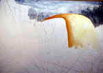
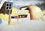
The next wash will be
the initial wash for the truck body. This was is done wet on wet. I wet
the entire area that I want to paint and then lay my pigment on evenly.
I'm using a pure wash of aureolin.
|
|
This is a wet on wet wash
using my two inch red sable brush. I bought this brush back in 1977 and
it cost me about $45. You can't even buy a brush of this quality and size
today.
|
As we move through the
painting, you will see how I continue to build on this initial wash. Glazing
the truck body like this gives me time to determine how the different
values within the painting are coming together and also creates a nice
effect--it just gives the body that bright glow that is perfect for the
watercolor medium. You can start to see how the dark shape of the foliage
on the right is pulling the viewer's eye in toward the truck body.
|
|
|
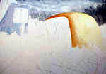
A second wash on the
truck body, and again it is done wet on wet. I am just building the form
of the body. There isn't much to these washes as long as you get your
pigment on the paper and don't play around with it too long. I have introduced
a bit of quinacridone gold along with the aureolin.
|
|
I can remember when I was
a child watching a Disney movie. There was always this paint brush that
would paint the scene before your eyes. I always have that feeling as
I'm progressing through a painting.
|
At this point, I want to move
to the upper left-handed corner and build a shape for the house in the background.
This is an important shape for the painting because it will create a strong
movement from the left-handed corner to the truck body. I chose a mix of
ultramarine blue and burnt sienna--with ultramarine the predominant color.
Again, I have left the wash lighter than I really want it--I'm also not
sure I want to go with ultramarine blue. |
|
If you are having difficulty
with the mud syndrome try using more pure pigment and if you have to mix
to make the color you want, try letting the pigments mix on the paper
rather than your palette.
|
After looking at the
blue wash on the house for a few minutes, I decided I want a color that
will connect better to what I'm using on the truck body. I mix a strong
wash of ultramarine and burnt sienna--it is almost the same color a burnt
umber, but it allows me to let the pigments granulate on the paper and
makes for a more interesting wash. You can see I didn't hold back on this
wash. If anything, I got it a bit too dark--I will decided about that
later in the painting when I have many of the other dark washes on the
paper. This was was done wet on wet.
|
|
You can see that I'm painting
pretty much from the top of the painting to the bottom of the painting,
slowly working my way down. That is generally the way most of my landscapes
go. I guess it allows me to go from general to specific.
|
It is time to get some
of the grass/brush parts of the painting layed in. I using a wash of aureolin.
I do this wash wet on dry--but as I go along, I'm adding good amounts
of water so I get almost the same effect of wet on wet. Right now, all
I'm interested in is filling area with the right color. There will be
more work to be done in these areas, but a bit later in the painting.
|
|
I read somewhere that the
part of our brain that interprets depth also processes value. One of the
strongest elements we can use to build depth in our paintings is value.
Light against dark or dark against light, both combinations help us to
build depth in our composition.
|
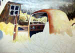
Several things are happening
here. I've started building depth with dark washes on the interior of
the truck. These washes are done with a mixture of thalo blue and red
rose. Mixed with pure pigment, it makes a nice juicy dark. I've also layed
in another wash on the truck body, continuing to build form. I've introduced
some burnt sienna at this pointing. This wash was done wet on dry, but
adding liberal amounts of water throughtout the process. The reason I
do the wash wet on dry is that I want some variation in the wash to build
texture on the truck body. I've also painted the car body to the left
of the truck with a wash of ultramarine blue and burnt sienna--blue being
the predominant pigment. I've also started defining the window on the
house, completed initial washes on the truck door and layed in a light
wash of aureolin below the truck door.
|
|
As artists we are fortunate
that we can go where our heart and intuition take us. This painting is
a good example--the orginal subject had good form, but let a lot to be
desired in the way of color. I don't have the slightest idea whether this
truck could have been yellow, but it was my choice and I went with what
I felt would work for this painting.
|
I've continued to build
the dark area on the inside of the truck. These real dark areas are thick
pigment--a combination of thalo blue and red rose. You can see that I've
started defining the upper part of the door and painted in some fabric
that is dropping down from the ceiling of the truck. While I'm working
through the detail of the truck, I'm thinking about where I want to go
with the light and dark shapes in the foreground.
|

I've also worked on the door, adding
dark areas where the interior of the door has fallen out. Since I spend
a great deal of time with these old relics, I've learned a lot about
them. If I can't see what I need in my photo, I know enough to invent
what I need to make the painting work. I never miss an opportunity to
observe things around me because I know I will be able to use that information
in a painting one day. I mentioned the tree texture thing, and I think
the reason I like watercolor is that it lets me create textures that
can't be found with any other medium. Whatever subject we look at--the
light is just doing all sorts of things on the surface. Watercolor lets
us capture that happening.
|
It It is time to get serious about the
foreground. I need to set the form of the truck off and need a dark
shape in the foreground. The dark wash that is a mixture of burnt sienna
and ultramarine blue with a light wash of quinacridone gold applied
after the main wash was dry. The wash is done wet on dry with burnt
sienna. Once the burnt sienna is in, I go back and add the ultramarine
blue at the bottom of the sienna wash--letting it mix on the paper.
It is important that you let it mix on the paper and don't mess with
it or it will turn to mud. I leave small areas of white paper and then
apply washes of water to let the burnt sienna and ultramarine blue seep
into those areas. In the photo I'm working from, there is no seat in
the truck cab--but I've elected to add a seat. To define the seat I've
done a light wash of a warm gray--making sure it is not a consistent
wash--pigment--a splash of water, more pigment and more splashes of
water. I want an uneven texture to give the effect of the stuffing coming
out of the seat. I've painted the tree trunk on the left side of the
painting--to create the texture on the trunk, I get some pigment and
introduce vertical strokes along the trunk. Then I get a couple of pieces
of watercolor paper that I've cut in two inch wide strips--about 8 inches
long. I lay them to either side of the trunk and then pull out my spray
bottle of water. I squirt some water on the trunk and let the pigment
blend--adding a few strokes with my brush until the texture feels right
for whatever kind of tree I'm painting. It works for me.
|
|
I've continued to work
on the truck body--building better form with washes of burnt sienna in
the shadow area. I've also added some aureolin washes on the light side
of the body. For the darker areas, the washes are done wet on dry--in
the light areas, they are done wet on wet--but I push them to almost when
the paper is getting dry because I want a little texture on the body of
the truck. The pigment will diffuse, but it won't move too well. You may
notice that I've also brought out an area across the back of the truck--it
is a raised area. I used a bristle brush to lightly scrub out the stripe.
|
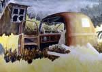
The foreground it starting
to come together. Here, I've added a light wash of aureolin to start establishing
what I want to do in the foreground. I like to put in a big general wash
like this to let me get a feel for where I want to go with a particular
area. I'm sure some artists just see where they want to go and just do
it straight out. That doesn't seem to work for me. I always need a little
warm-up. You can see that bright area on the right side of the painting--it
is really a light yellow wash of aureolin but for some reason it is not
coming out in the digital photo. I have been taking these photos in my
studio--sometimes during the night and sometimes during the day. Because
of the low light conditions, the contrast is good, but the color isn't
quite there.
|

You can see I've carried the shadow
from the right on over across the truck body to better set off the truck
body. Again I've used some strokes of burnt sienna and then introduced
some ultramarine blue at the lower part of the wash and then let it
blend together--sometimes bringing stokes of the ultramarine up on the
shadowed side of weeds.
|
I always hate this portion
of the painting because these dark areas in the foreground are really
necessary to make the overall composition work--but they are harder than
heck to make happen correctly. I seldom get them as right as I would like--but
manage to muddle through. They need to have intensity of color without
mud, have just the right amount of dark, medium and light values. I keep
thinking that one day I will understand how to do this well, but so far
it has eluded me. These washes are done wet on dry--nice and dark, leaving
open areas where I can overlay to create the medium and light values.
Usually I will paint the whole thing at one time, but since this is a
demonstration, I elected to put in the dark values and leave it for a
digital image.
|
|
Due to the nature of my
digital camera photos, the dark areas are darker in the images than in
the real painting. I haven't taken the time to adjust the images and don't
thing I will. That is a complicated process, in and of itself, it takes
a lot of time to get it right.
|
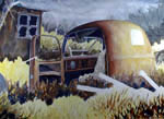
I want to hold the eye
to the center of the painting and to do that I need a good wash of dark
on the bottom of the painting. I menitoned above that I hate this part
of the painting because it is so critical. This is one wet on dry--with
some solid pigment--the combination of burnt sienna and ultramarine blue
I have mentioned above. I try to get some solid darks in--throw in a few
more medium darks--and leave a few highlights. On a scale of 1-10--with
10 being the best, I would describe this effort as about a 6. It didn't
work as well as I would have hoped. Since I stopped the painting for the
previous image, this wash was a matter of adding a few more darks, all
the mediums, and letting the lights do their thing. The mediums were done
wet on dry--just quick slaps of pigment mixed with burnt sienna and ultramarine
blue. For those of you artists that are into lots of color, I'm sure I'm
driving you crazy. What can I say? I've established the theme I want to
use for this painting and I'm sticking to it--it may not be all that dynamic,
but it will hold the whole compositon together.
|
|
You can see the stems of the brush in
the foreground--the stems are still masked. These stems will be the last
part of the painting. I know there are things I'm leaving out here--as
I paint, I see things that need to be attended to--and just grab some
pigment with my brush and do what I feel I need to do. You will note that
I've layed in a dark area for the back window of the truck. I've been
dying to get to that--dark against light---the ultimate for a watercolor
artist.
|
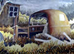
By this time, you may have
been wondering what those shapes were in the foreground coming from right
to left. I've painted them in--and as you can see, they are pipes of some
sort. These weren't in the original photo, but I found them in another photo
from another junk yard. My compositions are usually built from parts of
many photos. At this point in my artist life, I have about 10 albums of
photos that I draw on for paintings. The pipes were done wet on wet. I wet
the whole length of the pipe and then introduced pigment on the dark side
and let it flow and gradiate to the light side. The wash was mostly burnt
sienna with just a hint of ultramarine blue at the bottom of the darker
area. I again let it mix on the paper. |
|
|
I've removed the mask from
the tree branches coming down into the painting from the top. At this point,
the main passages of the painting are completed. I refer to this part of
the painting as my mob-up campaign. I just take care of the little details.
In this case, all I'm doing is painting in the tree limbs--one light wash
of cobalt blue--let dry and then build a little form with the addition of
burnt sienna on the side of the limbs away from the sun. |
|

Once the stems are completed,
I go back one more time and hit different areas with a medium wash of
burnt sienna--I don't want the bright stems to be too strong--a few highlights
and the effect of shadows falling across the stems.
|
I've finished the limbs and
have removed the mask from the brush in the foreground. We are now into
the final stages of the painting. To paint the stems of the brush, I first
wash each individual stem with a mixture of aureolin and quinacridone red--just
enough red to bring the aureolin toward the orange--not too much. Once that
is complete, I do the same that I did with the tree limbs--using a wash
of burnt sienna, quinacridone gold, and a bit of ultramarine blue, I build
form on the stems. I'm not too particular with this process--I want variation
on the stems and some of them get covered completely with pigment. |
|
|
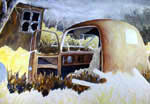
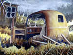
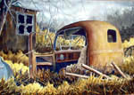
This is the final product.
It is hard to estimate my painting time as I'm sometimes painting, sometimes
looking, sometimes playing on the computer. A rough estimate would be about
10 hours. You will notice better color in this image and that is because
I took the painting out into the daylight to get the final image. I learned
something here--when the images are taken inside my studio in lower light
conditions, the contrast is better and the color is worse. When in the daylight,
the color is better and the contrast is worse. However, the contrast is
much easier to adjust. |
| My palette consisted
of the following colors: aurelolin, quinacridone gold, red rose, ultramarine
blue, burnt sienna, cobalt blue, and quinacridone red. |
|
